

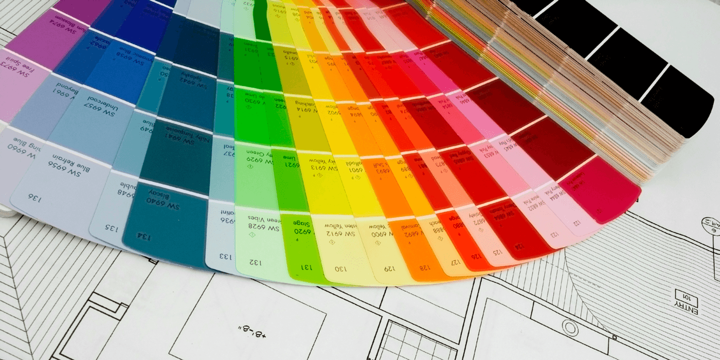
Paint colours really set the tone for your home, and when you’re building a new home, you’re working with a completely blank slate. It’s overwhelming to think about which colours should go on which walls.
Whether you like bold colours or traditional styles, let’s take a look at some of the best colours you can use in your home.
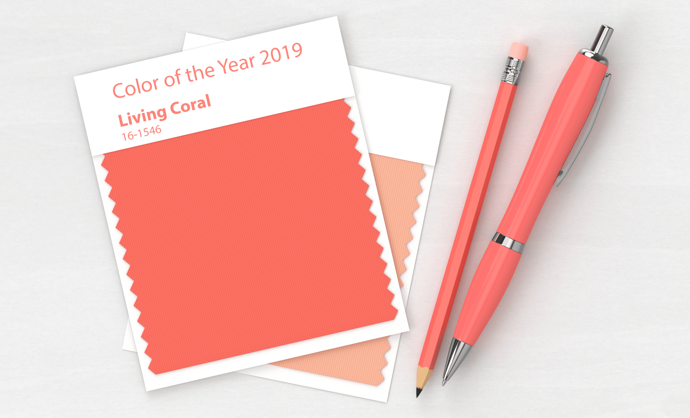
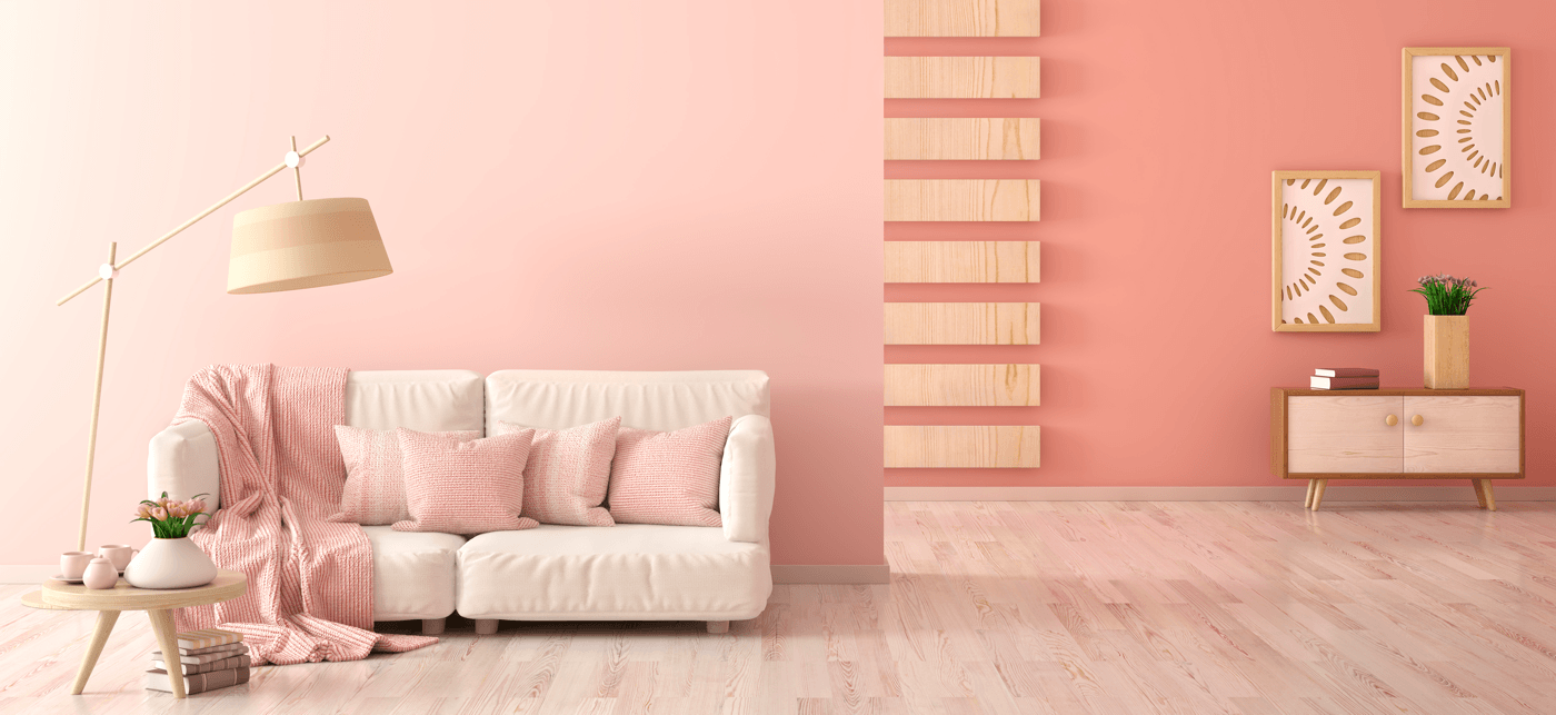
Living Coral
Living Coral is the name of Pantone’s Color of the Year for 2019. Kind of a cross between pink and orange, the colour is probably a bit too bright for painting, say, the living room, but there are definitely ways you can use this colour to bring some life into any room. For instance, it could be a nice colour to use on a smaller accent wall or in the tile backsplash in the kitchen. You might be able to get away with having it on the walls in a half-bathroom if you’re the type of person who enjoys rich colours.
Otherwise, this might be a good colour to use as an accent to something a bit more neutral.
Blueprint
If you prefer the idea of a calming blue, you should take a look at Behr’s Color of the Year for 2019: a deep shade of blue called “Blueprint.” Some people might consider this colour too bold, and there’s a chance that it could make a room feel dark if you were to paint all four walls in the dark shade. However, it can also appear stately depending on how you use it. For instance, it would be a great colour for a teenage boy’s room. You could also make it feel lighter by pairing it with a bright white trim around windows and door frames. Behr also offers four different palette options based around Blueprint: monochromatic, earth tones, pastels, and jewel tones.

Night Watch
Along the same lines of a darker colour that looks surprisingly great on all four walls is PPG Paints’ Color of the Year, Night Watch. It’s a dark green colour that can look funky or stately depending on what type of furniture you have in your room. It would look nice in a formal dining room or a home office. Remember that you will probably want to balance it out a bit with some lighter colours, so be sure to pair it with softer tones, such as a white stone surround for the fireplace, a light-coloured laminate flooring, or a beige sofa.
Metropolitan
Looking for something stylish, yet neutral? Look no further than Benjamin Moore’s Color of the Year: Metropolitan. This is a cool grey colour that’s sure to set your home apart from the crowd. It’s definitely less boring than white, and feels more modern than the plain grey or beige colours that have been popular for a while. Best of all Benjamin Moore also has a palette of 2019 filled with colours that will nicely match Metropolitan. For instance, “Head Over Heels” is a light pink colour that could make a room feel more feminine and whimsical when paired with Metropolitan. “Beau Green,” on the other hand, is a rich shade of teal that could give your home a more dramatic look.
Great Colour Tools
Don’t feel stressed just because you don’t have an artist’s eye for design. There are plenty of tools you can use to help you find the right colours for you. When you buy a home from Sterling, you’re able to meet with an interior decorator who can easily match colours based on a few that you like. If you want to play around with some things yourself, though, look at some of the online tools offered by paint companies.
For instance, Benjamin Moore has a tool that chooses a palette for you based on a single colour you like, then allows you to see what that colour scheme will look like in various styles of rooms. It’s not your exact home, but it gives you a sense of what the balance could look like.
Behr has a similar tool that also allows you to upload pictures of your own rooms. However, they also have the fun Color Discovery tool that gives you a place to start based on the room and the sense of style you choose.
Your home should reflect your unique personality, and you can do this by selecting a colour palette that projects the image that you want. Take some time to look through design magazines or websites to build a greater sense of your style, then use your favourite images to choose colours for your home.
